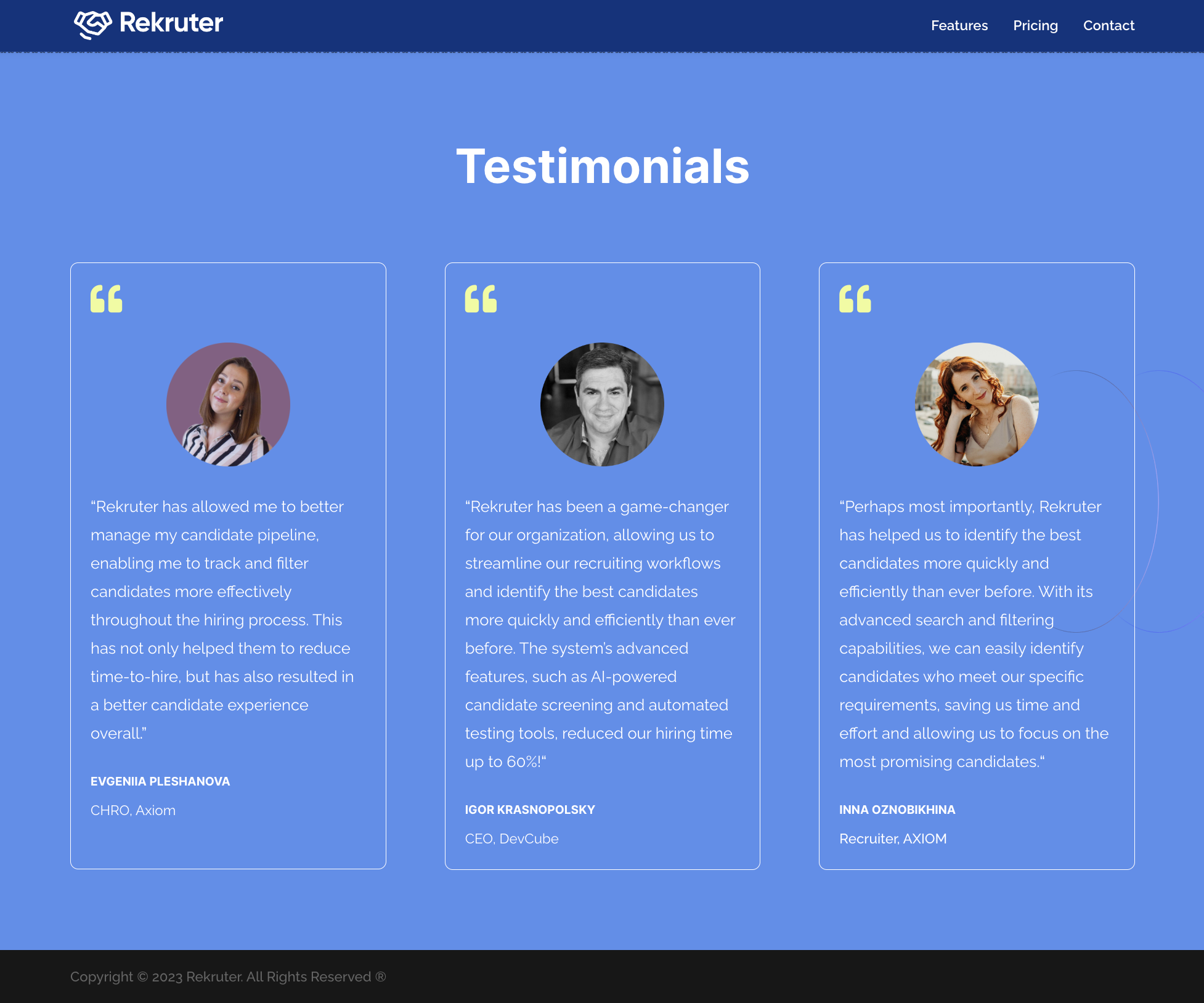
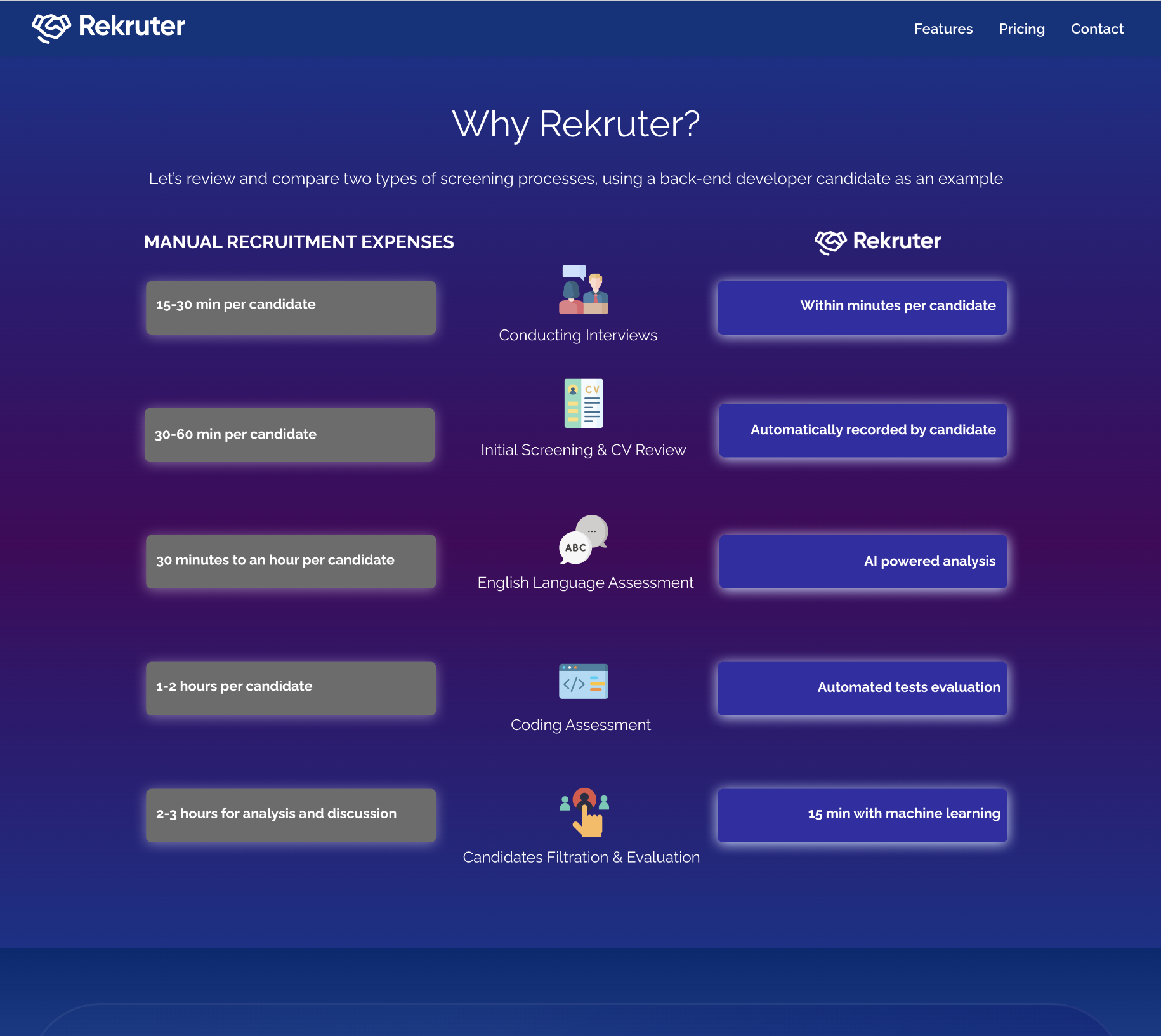
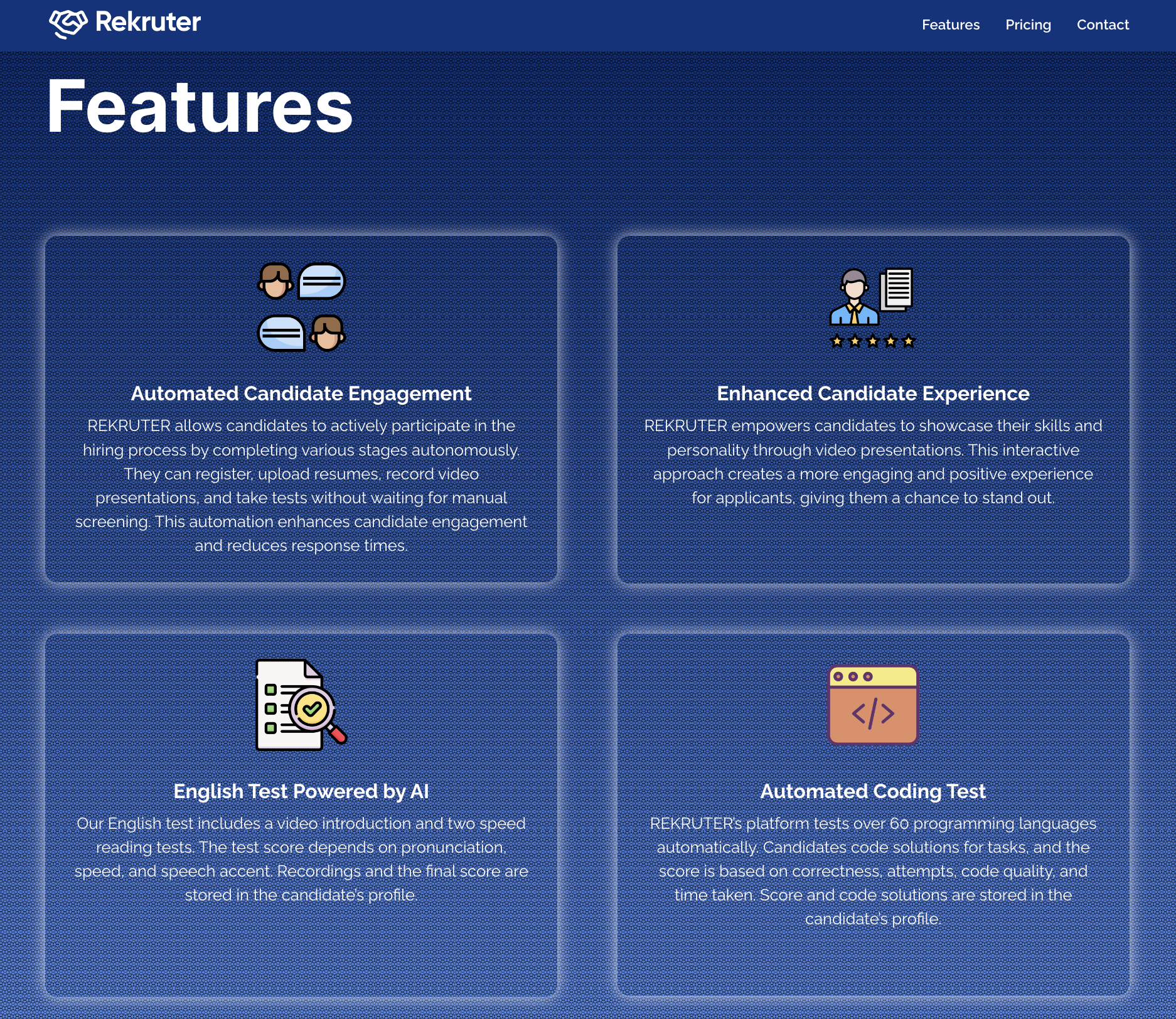
Explore Rekruter’s Dynamic Features

Rekruter.ai identified a pressing need for a substantial website makeover. The existing site fell short in terms of visual aesthetics, user-friendliness, and conveying a compelling brand image.
The Challenge
- Inconsistent Font: The font used on the website lacked uniformity, and the “E” letter needed refinement.
- Lack of Engagement: The website was static and lacked interactive elements, diminishing user engagement.
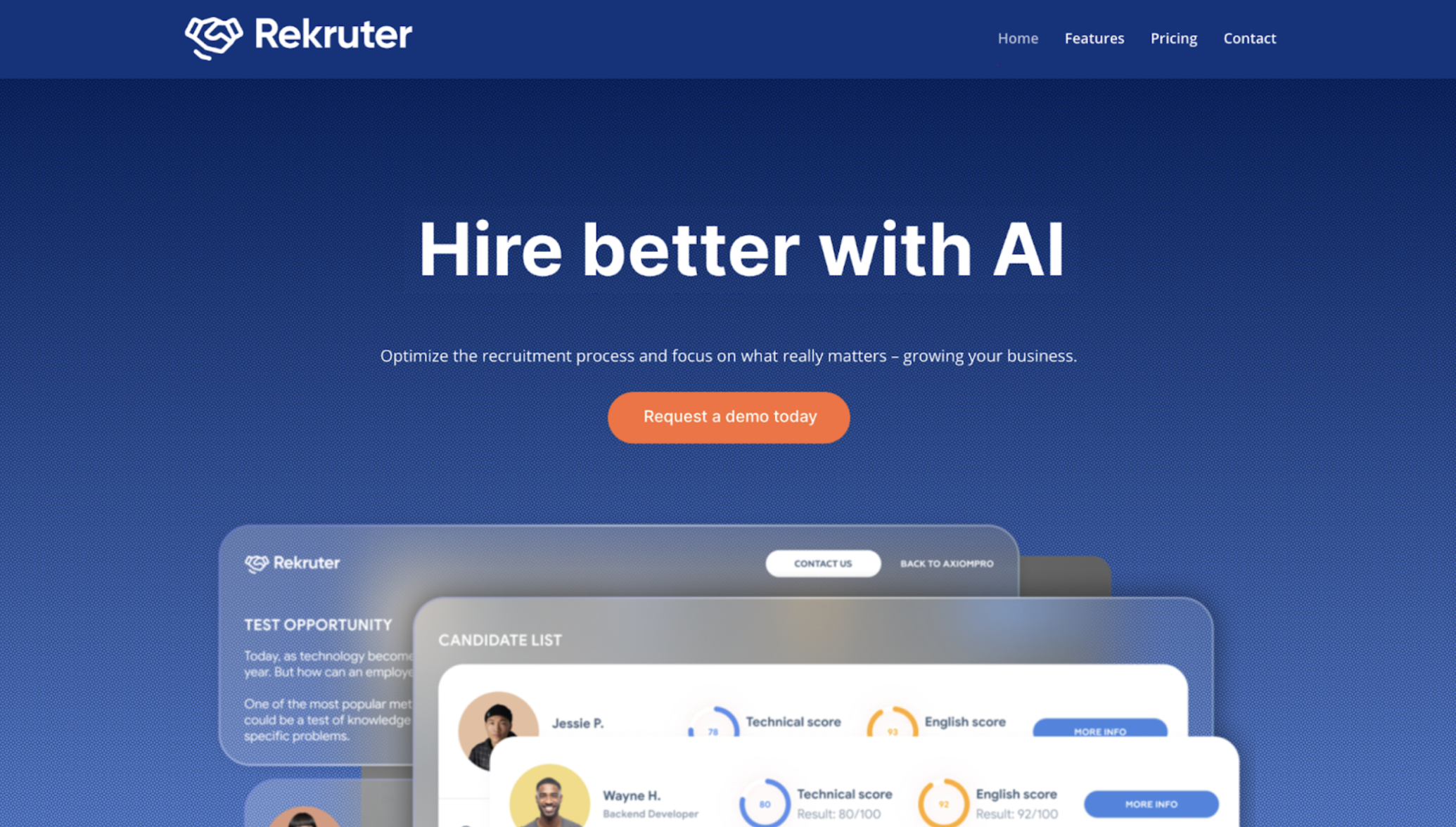
- Visual Quality: The quality of visuals, particularly screenshots, was subpar and required enhancement.
- Service Description: The website didn’t effectively communicate that Rekruter.ai served as both a marketing tool and a comprehensive candidate database.
- Call-to-Action (CTA): CTAs needed animation to captivate attention and promote user interaction.
- Design Discrepancies: The website’s design lacked consistency, including the absence of squarish frames.
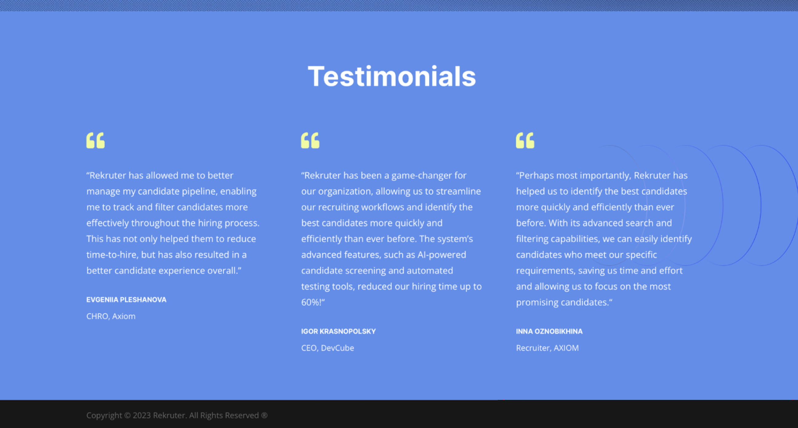
- Testimonial Presentation: Testimonials lacked a personal touch, as images of real people were missing.
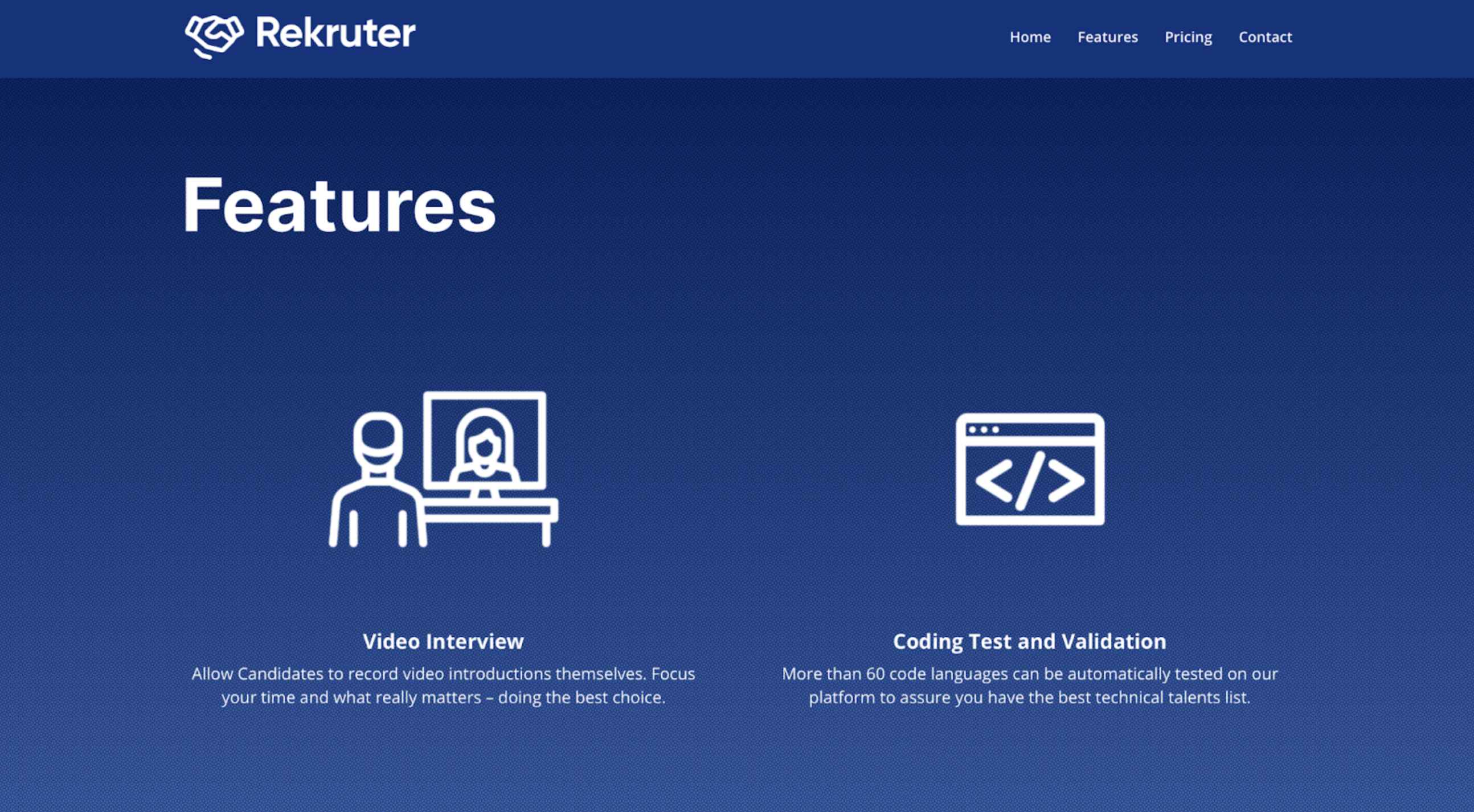
- Redundant Elements: The “Home” button seemed redundant, as clicking on the logo could perform the same function.
- Social Media Integration: Icons representing Rekruter.ai’s social media presence were missing, impacting online visibility.
- Social Media Significance: The importance of maintaining a social media presence required emphasis.
- Text Proportionality: Text and icons needed adjustments to ensure a balanced visual layout.
- Footer Social Icons: Social media icons were absent from the footer section.
Blog Page: Consideration was given to adding a dedicated “Blog” page to enhance content engagement and SEO.
Our Solutions
- Font Refinement: We meticulously adjusted the font to ensure uniformity and addressed the specific issue with the “E” letter.
- Dynamic CTAs: To encourage user interaction, we introduced animations to CTAs, making them attention-grabbing and interactive.
- Visual Enhancement: Visual elements, particularly screenshots, underwent thorough improvement to guarantee crispness and clarity.
- Service Emphasis: We strategically added a clear emphasis on Rekruter.ai’s dual role as both a marketing tool and a comprehensive candidate database, showcasing its unique value proposition.
- Design Consistency: Squarish frames were introduced to maintain a consistent design style across the website.
- Personalized Testimonials: Testimonials were updated with images of real people, creating a more personal and relatable connection with potential clients.
- Redundancy Elimination: The redundant “Home” button was removed, streamlining the navigation experience to align with standard web practices.
- Social Media Integration: Icons representing Rekruter.ai’s presence on social media platforms, including LinkedIn and Facebook/Instagram, were incorporated to improve online visibility and engagement.
- Social Media Importance: A dedicated section underscored the significance of an active social media presence, highlighting the manifold advantages it offers, from increased visibility to brand authority and thought leadership.
- Text and Icon Balance: Adjustments were made to text and icons to maintain proportionality, ensuring an aesthetically pleasing and readable layout.
- Footer Social Icons: Social media icons were strategically placed in the footer section for user convenience and visibility.
- Blog Page Addition (Recommended): We strongly recommended the addition of a dedicated “Blog” page, outlining the numerous benefits it could bring to Rekruter.ai, including content engagement and SEO improvement.
